April 10, 2019

Processing Oblique UAS Imagery Using Image Annotation


Introduction

            Often times when collecting UAS data, the imagery is taken at nadir, meaning the camera sensor is pointed vertically downward. This collection method is used when flying over mostly horizontal surfaces, where a top down view of the area is desired. When collecting data of something like the facade of a building, or a mostly vertical object, data collected at nadir will not have enough information to correctly model the vertical surfaces (see figure 1).
Figure 1: Example of Not Enough Information to Model Vertical Surfaces of a Silo

            To capture enough information to correctly model mostly vertical surfaces, the sensor must be angled at some oblique angle usually between 30 and 60 degrees. Multiple passes in different directions must be flown to ensure full coverage; different altitudes and angles is recommended to achieve the best results. Figure 2 below shows the the difference between taking nadir imagery versus oblique imagery.
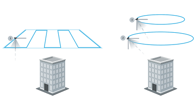
Figure 2: Taking Nadir Imagery Versus Taking Oblique Imagery
(Image sourced from https://support.skycatch.com)

            When oblique imagery is processed with nadir imagery, the best of both techniques is combined and the results are better than either technique alone. Figure 3 shows multiple passes of oblique and nadir images taken to create a 3D model of Michigan Central Station. Check out the Pix4D website linked here to view the interactive 3D model.
Figure 3: Michigan Central Station Nadir and Oblique Imagery
(Image Sourced From www.pix4d.com)

What are the strong points and weak points of mapping in nadir vs. in an oblique fashion?
  • Nadir
    • The advantage of nadir imagery is that the mission can be laid in any orientation and as long as there is enough overlap, the same data will be collected in one direction as another.
    • The disadvantage of nadir imagery is as stated above, it does not capture vertical surfaces.
  • Oblique
    • The advantage of oblique imagery is that it can capture vertical surfaces as well as some horizontal ones. 
    • The disadvantage of oblique imagery is that one has to fly at multiple passes in different directions, angles, and altitudes to get good data. Another disadvantage is that oblique imagery will capture unwanted background details and when processing, it will result in unwanted artifacts and noise to appear in the model.

            To combat the issue of noise and unwanted artifacts, Pix4D came up with a solution called image annotation.  

What is Image Annotation?
            Image annotation as used in Pix4D Mapper is the process of cleaning up noisy datasets by removing objects and clarifying what is background and what is foreground, so that clean models can be generated.

At what phase in the processing is this performed?
            Step 1, Initial Processing, must be complete before one can annotate the images however, one may also annotate the images after step 2, Point Cloud and Mesh then reprocess step 2 again.   

What types of Image Annotation are there?
  • There are three types of image annotation Mask, Carve and Global Mask. The Mask annotation tool classifies pixels in the image not to be used for processing. It allows the removal of obstacles that appear in only a few images such as a car captured in a few images as it moves down a road. Mask also allows the user to remove the background of an orthoplane as shown in a Pix4D help video linked here. Figure 4 below is a an image of the orthoplane masking process taken from the aforementioned video. 
Figure 4: Mask tool Being Used to Remove a Background of the Orthoplane

  • The Carve tool removes the 3D points associated with the annotated parts of the image in the rayCloud. It also deletes the rays that connect the camera centers and the annotated pixels (see figure 5). This means that neither the 3D points, nor the annotated pixels are used for processing.
Figure 5: How the Carve Tool Functions 
            *Note: The Carve tool can be used to remove unwanted parts of a dataset such as the sky.

  • The Global Mask annotation tool allows the user to annotate a specific region in the image to be excluded from processing in every single image throughout the dataset. Described another way, the tool removes the same region of pixels in every image and ensures that they are not processed. This tool can be helpful when one needs to remove the landing gear from each image in the dataset.


Methods:

            Before one can process the oblique imagery, one must first collect it. As discussed above, when collecting oblique imagery, one must be sure to have many different angles of the object from different sides and altitudes to ensure full coverage of the object. A suggestion would be to fly once at nadir then fly a circle around the object with the sensor at some low angle from nadir, then fly another orbit at a lower altitude with the sensor angled up higher. Repeat this circular pattern at lower altitudes and higher camera angles as necessary to gain enough information to create a model. Figure 6 below is a flight where the suggestion made above was used to gather the oblique data. 
Figure 6: Circular Pattern of Collecting Oblique Imagery

            Once the oblique imagery is gathered, it will need to be initially processed, annotated, and post processed to remove certain noise and/or artifacts. The process for how to perform image annotation is documented on the Pix4D Support page by typing “image annotation” into the search bar or by clicking on the direct link here. Alternately, one can follow the steps listed below.

Step 1:
            Follow steps 1 through 8 of my february 11th post changing step 7 to select 3D Models then start the Initial Processing.  

Step 2:
            Once initial processing is complete, click the rayCloud icon located on the left sidebar then open the drop down for Calibrated Cameras located in the Layers area underneath Cameras.

Step 3:
            Select an image and click on the pencil icon  on the right side of the screen and once it is done loading, select the appropriate annotation tool to use as discussed in the intro.

            *Note: A good rule of thumb is, if one would like to keep the background in the model, use the Mask tool. If one just wants the object of interest and nothing else, use the Carve tool. If one needs to remove something that is in the same place in every image frame, use the Global Mask tool.

            *Tip: If areas of the object do not have many photos covering them from every angle and altitude, it may be better to use the Mask tool instead of the the Carve tool as the results will come out more cleanly.

            Figure 7 below shows steps 2 and 3 of the process of how to do image annotation
Figure 7: Steps 2 and 3 of Image Annotation

Step 4:
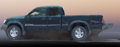
  Left click and/or click and hold down the left mouse button and paint around the area one wishes to annotate out. If one accidentally annotates something out that he or she wishes to keep, hover over the area until it becomes darker and then click and that area will be un-annotated again. Figure 8 shows the process of using the Carve tool to annotate an image of Professor Hupy’s Truck. 
Figure 8: Carve Annotation Tool Progression on Image
Step 5:
  Repeat Step 4 on several (4-6) images taken from different angles and altitudes then uncheck Initial Processing, check the Point Cloud and Mesh box and click start. 

Step 6:
  Once Point Cloud and Mesh is finished processing, inspect the results and adjust the annotation method as needed to clean up the 3D model.


Discussion / Results:

  Using the information above, two datasets were annotated. The datasets that were annotated were of Professor Hupy’s truck and, a light pole (see figure 9). 
Figure 9: Images of the Two Datasets Annotated

  The annotation tool used for each of these datasets was experimented with and it was found that the Carve tool worked best for Professor Hupy’s truck while the Mask tool worked better for the light pole.

Professor Hupy’s Truck:
  The Carve tool may have worked better than another tool on the truck dataset because it removed the extra background from the rayCloud making it easier to process. Video 1 below is a video orbiting the truck, viewing the truck from multiple angles. 
Video 1: Professor Hupy's Truck Pix4D Results

  Overall, the results of Professor Hupy’s truck look relatively good however there are two main problem areas. First, there are not enough images taken at a low enough altitude to gather more of what is below the truck and as a result there are extra blobs connected to the tailgate and underside of the truck that shouldn’t be there (see figure 10). Second, areas that are reflective or transparent such as the truck paint and window glass become very distorted as shown in figure 11.
Figure 10:  Errors Underneath Hupy’s Truck

Figure 11: Errors with Transparent or Reflective Surfaces
  To improve the data and combat the extra blobs underneath the truck, more orbits around the truck are necessary at a very low altitude with the camera -- almost horizontal. As for the reflective and translucent surfaces, there is not much that can be done unless the images are collected in a grey room with diffused light so that there are less erroneous reflections for Pix4D to use. 

What objects seem to be the most difficult to truly capture in 3D - speculate why.
  Looking at the 3D model of the truck, it seems as though anything that is reflective or transparent is very difficult to capture as they are see-through or have reflections that change from image to image, making it almost impossible to correctly generate 3D points. 

The Light Pole:
  The light pole as mentioned above was processed using the Mask annotation tool. The Mask annotation tool was used in this case over the carve tool because not enough 3D points were created on the light pole alone to just use it. The Mask tool made it easier to distinguish the foreground from the background and clean up the 3D model while simultaneously allowing the background to remain. Below is video 2 showing a virtual flight around light pole.
Video 2: Lightpole Pix4D Results 

  Looking at the video above, the results look mostly good with some errors and missing sections. The area of the pole below the lights was missing probably due to there not being enough images of that particular area, due to the lights and crossbar obscuring the view of the pole in certain images.

  In addition to the missing sections, 3D points of the ground surrounding the light pole were mistakenly grafted to the pole, lights and light support crossmember; when the triangle mesh was visualized, the extra unwanted blobs were added to the structure (see video 3).
Video 3: Lightpole Blobs

  To improve the missing sections mentioned above, an additional flight lower in altitude around the light pole with the camera horizontal could help Pix4D have enough data to create 3D points in that area. 


Conclusions:

  With the addition of oblique imagery to a dataset, the images may be annotated, less noisy 3D models of an object may be created and used in a professional setting, to convey the object from a more natural, human point of view, allowing the client to better grasp and interact with the information displayed.

April 8, 2019

2 April 2019 Martell Forest Summary and Field Notes


            Disclaimer: This post is a general overview of the flights of Martell Forest flown with the DJI M600 on April 2nd and not meant to be an in depth analysis of the day’s flights. 

Introduction:
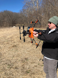
            On Tuesday, April 2th, our AT319 class went to Martell Forest to fly the Zenmuse X5 RGB sensor. The UAV used was the DJI M600 and the Zenmuse X5 was mounted on a gimbal. Figure 1 below shows an image of the M600 sitting on the launch pad with the Zenmuse affixed underneath it. 
Figure 1: M600 with Zenmuse X5

            The location of the flight was Martell Forest and the mission was to fly two flights with the M600 in a cross grid pattern one with the camera at nadir and the other with the camera at 60° below the horizon.

            The goal of the mission was to both collect data as well as to get our AT319 class experienced working as a team to setup and run all aspects of a UAS operation. To this end, at the location, the class split into two groups, one to setup the M600 and the other to set out the GCPs. Since I helped set up the UAV in the previous mission, I went with the group setting out the Propellor AeroPoints GCPs. 

AeroPoint GCP Placement:
            When placing the AeroPoint GCPs there are several important factors that must be taken into account for successful deployment. These factors are listed below:

  • Clear view of sky 
    • It is essential that the GCPs have a clear view of the sky so that they may receive GPS signals from satellites.
      • Tree cover may affect these weak signals and may cause inaccuracies to occur.
  • GCPs within sensor coverage areas
    • GCPs must be placed in an area that will be visible to the UAV in multiple photos so that they may be properly used when processing.
  • Even distribution
    • GCPs must be evenly distributed throughout the mission area so that the data is not pulled/skewed by many GCPs in one area and no GCPs in another when processing. 
  • Terrain changes
    • If the terrain varies significantly across the mission area, distribute some of the GCPs in high and low areas.
  • Line-of-Sight
    • The AeroPoint GCPs communicate with one another while they are in place so it is important that they are somewhat visible to each other.
  • GCPs on
    • Turn each GCP on only after they are placed to avoid erroneous readings and bad data.
  • Photograph and note each GCP’s location
    • Take pictures of each GCP when it is placed to aid in identification later when processing data (see figure 2). 
    • Take field notes of the locations and create a rough map. 
      • Field ID number
      • Last 3 digits of the serial number
      • Include a location description
  • Kept running > 45 minutes
    • The GCPs need at least 45 minutes to take multiple position readings and increase their accuracy.
  • GCPs off
    • Before moving a GCP, it is important that it is off. Press the red power button and wait until the light stops flashing then collect it. 
  • Collected in reverse order
    • Make sure to collect the GCPs in reverse order that they were distributed in. 


Flights:
            Once all the GCPs were laid out, our group rejoined the main group and the M600 was launched. Professor Hupy flew the first flight and I flew the second flight. Both flights went smoothly with no issues. Video 1 below shows the the begging of the first flight.
Video 1: M600 Beginning of Initial Flight

            Once these flights were completed, Professor Hupy decided to gather some Geospatial video of the road leading to the forest. Three passes following the road were performed by Lucus Write then the M600 was landed,packed away and the GCPs were collected. 

Conclusion:
            Overall, the day’s flights were a resounding success and the mission went flawlessly. We will have to see how the data turns out once it is uploaded.

April 2, 2019


Yuneec H520 Martell Forest Incident Notes

            The purpose of this post is to create a general checklist for how UAS operations should be conducted as a result of the 3/26 Yuneec H520 crash to reduce in-field UAS incidents from occurring. 


Background:
            On the day of the operation, the weather as reported by the near by the KLAF airport METAR was 7 mph wind coming from the northeast, clear skies with 10 statute miles visibility with a temperature of 27 degrees Fahrenheit. The operating area, Martell Forest, was just west of the KLAF Class D airspace (see figure 1). Martell Forest, was located in a depression surrounded in hill covered trees. The area to be imaged was of a specific stand of trees as shown in figure 1. 
Figure 1: Martell Forest Location in Relation to KLAF
            The students drove to the Martell Forest location and were split into two groups. The first group set out the Propellor AeroPoints GCPs while the second group set up the UAS platform.


Setting up the Propellor Aeropoints GCPs:
            Aeropoint GCPs made by the company Propellor, are individual GCP targets with built-in survey grade GPS units. One sets them up at the beginning of a flight, overflies them during the data collection, then collects and uses their coordinates to correctly geolocate images. Figure 2 is an image of a Propellor Aeropoint GCP. 
Figure 2: Propeller Aeropoint GCP

            The GCPs were laid out in in a a well distributed pattern with some around the perimeter and some within the stand of trees being flown as shown in figure 3. This image was created by Hans-Olof Gustafsson and is used with his permission. Check out his blog linked here.
Figure 3: GCP Placement

*To learn more about how to properly place and use GCPs in your dataset, please refer to my February 14th post which walks you through the placement and processing when using GCPs.  


UAS Platform and Sensor Used: 
            The UAS system used was the Yuneec H520 with the E90 sensor (see figure 4).
Figure 4: Yuneec H520 with E90 Sensor
            The Yuneec H520 is a short range high endurance platform with approximately 25 minute flight time depending on the sensor. The sensor attached in the image above is the E90 sensor, a 20 megapixel RGB gimbaled sensor. The UAS uses the ST16S all-in-one controller with a built in tablet interface that allows the user to setup, view what the sensor sees, and adjust parameters in mid flight without the use of an external device (see figure 5).
Figure 5: ST16S all-in-one controller


Mission Planning:
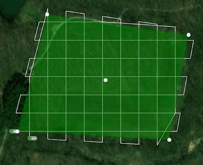
            For data analysis purposes, the mission was planned for two flights each flown in a crosshatch pattern at 80 meters, one with the sensor at nadir, and the other with the sensor angled at 45 degrees. Figure 6 below is an image of the planned flight path.
Figure 6: Flight Path


UAS Setup and Calibration:
            When setting up the UAS, the battery and props were installed by Professor Hupy and the process of connecting to and calibrating the Yuneec H520’s compass, accelerometer, and gimbal were performed as a group. For the compass calibration, the hexacopter was rotated about all of its axes, following the instructions of the controller as shown in figure 7 and video 1. 
Figure 7: Compass Calibration
Video 1: Compass Calibration

            Once complete, the accelerometer of the hexacopter was calibrated by placing and holding the hexacopter in various orientations as dictated by the ST16S controller as shown in figure 8 and 9. Figure 8 shows the ST16S screen and figure 9 shows the hexacopter being held in one of the required orientations. 
Figure 8: Accelerometer Calibration Screen

Figure 9: Accelerometer Calibration Being Performed on Hexacopter
            After the accelerometer was done calibrating, the hexacopter was placed on the ground and the gimbal was started and the hexacopter automatically ran the calibration as shown in video 2 below.


The Flight:
            For the flight, Lucus Write was the remote pilot in command (RPIC) and I acted as the visual observer (VO). The Yuneec was armed and professor Hupy instructed Lucus to ascend to an altitude clear of the trees and test the controls. The takeoff went smoothly but as Lucus pulled back on the stick to get a feel for the hexacopter, the rear mounted battery came unclipped and left it with no power. The Hexacopter crashed and broke its landing gear and three of its arms. Video 3 shows the takeoff and subsequent crash. 


Post Crash Debrief:

            The cause of this crash was due to human error and bad design. When sliding the battery into place, it did not click and give positive feedback that it was connected and lock in. It partially locked which allowed it to be rotated and power the copter without ejecting however once in flight, it dislodged and caused the aircraft to lose power and crash. A design that allows the copter to be powered while the battery is not completely locked into place is a bad design and should be altered to correct it.

            To reduce the chance that a person may not correctly install the battery, checklists should be used with two or more items that have the operator check that the battery is properly installed. If the operator is not the one performing the preflight checks, he or she should still observe it to catch potential errors in the process.

Contributing factors that led to this incident included complacency, distraction, and lack of checklist use. 
  • The complacency of thinking, “the Yuneec performed well yesterday, why should it be any different today” can be combated by creating and following a rigorous checklist. 
  • During the setup and flight process there was a high level of distraction due to many students asking questions and crowding around trying to get pictures. This could be reduced by implementing a policy of no one hovering over or talking to the RPIC while the UAS is being setup. *Note: In the case of the Yuneec, the preflight setup can be streamed to a seperate screen so that the TA can explain the setup process while the RPIC is doing it. 
  • The lack of checklist use with all of the preflight, flight, and postflight information listed could help avoid mistakes in the process and prevent them from happening again. The next section below is a general checklist of the things that one should check before, during after a flight.

General Checklist:


Before Heading to the Location
  • Confirm location, date, and time with client(s)
  • Confirm availability of observer
  • Location clear of restricted or prohibited airspace
  • Location is clear of controlled airspace
    • If no: File LAANC for approval if available for the area
      • If  LAANC not available and there are no COAs or Waivers, operation is a no-go.
  • Area surveyed on Google maps and notes created for: 
    • hazards/obstacles
      • Power lines
      • Telephone poles 
      • Trees 
      • Terrain 
      • Fences 
      • locations of persons or property in mission area
      • Other manned aircraft activity 
        • crop dusting 
        • helicopter activity 
        • skydiving activity 
        • hang gliding / para-motoring / ultralight activities 
      • Freeways, highways, roads 
      • Radio tower locations for possible electromagnetic interference (EMI) and radio-frequency interference (RFI))
    • Takeoff and landing location  
  • Weather checked: 
    • visibility >3SM
    • ceiling >500ft above flight altitude, 2000ft horizontal separation
    • precipitation
    • Kp index
    • wind direction and velocity
    • sun angle (if applicable) 
  • Batteries charged:
    • Flight batteries charged
    • Controller battery charged 
    • Sensor batteries charged (if applicable)
  • UAS airframe 
    • General inspection
      • cracks, dents, chips, loose or disconnected wires 
    • Arms free of damage and swinging and latching mechanism in good working order 
    • Landing gear and retract assembly (if applicable) inspect for damage.
  • Software to update
    • controller
    • UAS system
    • sensor payload package
  • Sensor Package 
    • correctly installed 
    • boots up correctly 
    • SD cards 
      • empty 
      • formatted for data files
  • Emergency repair kit packed
  • Controller
    • Physical condition checked 
    • antennas installed an unbroken 
    • switches and gimbals move freely and correctly
    • controller powers on 

On Location Preflight and Setup
  • Location scouted for hazards and obstacles 
  • GCPs setout and their location and ID recorded
  •  Launch and recovery system setup and checked (if applicable)
  • Antennas of controller and UAS installed
  • controller powered up 
  • flight plan (mission) setup
    • type of flight 
    • altitude 
    • airspeed 
    • overlap and sidelap
    • sensor angle 
  • Sensor lens cap removed
  • UAS Arms folded out, checked locked in upright position 
  • UAS powered on 
  • Connection between controller and UAS established
  • Satellite count >6
  • Flight plan uploaded 
  • UAS calibrated 
    • Accelerometer 
    • Magnetometer
    • sensor gimbal (if applicable) 
  • Feedback that sensor is ready to collect data
    • visual indication on data package (lights) or
    • in app sensor monitoring  
  • Prop guards removed (if applicable)
  • Props Straightened or installed as necessary
  • Confirm gimbal movement free and correct
  • Failsafes set 
    • RTL at 20% battery
    • RTH loss of link 
    • Land in place if <5% battery
Flight
  • UAS Armed
  • Takeoff 
  • Controls correct
    • pitch forward / pitch back / roll left / roll right / yaw left / yaw right
  • Climb to mission altitude
  • Start mission
    • Notes:
      • During the mission, constantly monitor the UAS battery for sudden reductions in percentage caused by bad or old batteries. 
      • Monitor the controller and UAS visually for anomalous behavior and errors.
      • Orient yourself in the same direction as the UAS is facing at all times.
  • Ensure sensor is collecting data (if possible). 
Post-flight
  •  Sensor properly shut down
  • UAS powered down
  • SD cards collected and stored in a safe, known location
  • Props folded or removed as necessary 
    • Prop guards installed (if applicable)
  • Sensor Package secured
  •  Logbook entry 
    • Date
    • Time
    • Location
    • Weather
    • Aircraft used
    • Mission duration
    • Pilot in command name
    • Certificate #
    • Notes
      • Key Metadata
        • Sensor used 
        • Sensor coordinates 
        • UAS coordinates 
        • GCP type and coordinates 
        • Altitude flown
        • Camera angle 
        • sensor overlap and sidelap
        • Sun angle  

March 18, 2019

Using ArcGIS Pro to engage in Value Added Data Analysis

            When using ArcGIS Pro, one of the very useful tutorials that one can take is a tutorial on calculating impervious surfaces from spectral imagery. This tutorial walks the user through the process of using multispectral data to analyze which areas are pervious and which are not, so that a local government, for example, can determine storm water bills for each property based on how much pervious versus impervious features exist on a parcel of land.

            To follow the step by step lessons that walk one through each step, follow the ArcGIS Pro tutorial linked here.

            Below is listed a rough outline of the steps in each lesson. Because the tutorial shows the step by step process, I will just include a rough outline of these steps along with some of the resulting imagery.

Lesson 1: Segment the Imagery
  • Download and open the project provided in the tutorial
  • Extract the spectral bands that will allow the user to easily identify different features (See figure 1). The bands extracted were:
                       i)   Near infrared band for vegetation.
                       ii)  Red band to emphasize man-made objects and vegetation.
                       iii) Blue band to show bodies of water.
Figure 1: Extracting Spectral Bands
  • Configure the classification wizard for segmenting the image.
  • Segment the image by grouping neighboring pixels with similar spectral characteristics into groups (See figure 2).
Figure 2: Image Segmentation

Lesson 2: Classify the Imagery

  • Create training sample polygons of the different features by first creating two parent classes called impervious and pervious. Then within them, create  subclasses of grey roofs, roads, driveways, bare earth, grass, water, and shadows. Within these subclasses, add polygon of examples of driveways, roads grass etc.. Figure 3 below shows examples of different sample polygons being selected.
Figure 3: Creating Training Samples
  • Classify the imagery using the samples gathered above and the Support Classification Vector classifier. Figure 4 shows the imagery once it has been classified.
Figure 4: Classifying the imagery
  • Once classified, merge the subclasses into their parent classes to create a new layer with only two classes that show whether a feature is pervious or impervious (See figure 5).
Figure 5: Merging Classes

  • Reclassify errors where regions are misclassified with the Reclassify Within A Region tool within the wizard.

Lesson 3: Calculate Impervious Surface Area
  • Create accuracy assessment points to measure the accuracy of the merged classification and use the resulting accuracy points table, along with the Louisville_Neighborhood TIFF, to assign ground truth values. Figure 6 shows the 100 stratified random sample points generated along with an abbreviated visualization of the ground truthing.
Figure 6: Accuracy Assessment Points and Ground Truthing Process
  • Compute a confusion matrix table to compare the classified data with the ground truth data to determine the percentage of accuracy between the two. Figure 7 below is a table showing the confusion matrix with 92% overall classification accuracy.
Figure 7: Confusion Matrix
  • Tabulate the impervious areas within specific parcels by first calculating the areas of impervious vs. pervious data, then merging it with the parcels layer for the final individualized parcel layer. Figure 8 shows a table containing the impervious and pervious areas.
Figure 8: Tabulated Pervious versus Impervious Areas

  • Symbolize the parcels to show the amount of impervious area in each parcel. Figure 9 is a map of the parcel areas sorted by color in terms of their impervious area.

Figure 9: Parcel Impervious Map

            Looking at the map, the most impervious areas are the roads in red, while the most pervious areas are those depicted in yellow. The colors in between correspond to medium impervious areas.

            If one examines the lake in the center, for some reason it is shown as less pervious than the parcels with houses on them. This is probably a glitch however, for the purposes of charging storm water bills; it does not really factor in as no one individual owns that parcel.

March 5, 2019

Volumetric Analysis with UAS Data

Introduction:

What is volumetric analysis? When is it used?
            Volumetric analysis is the process of calculating the volume change between two surfaces. It works by setting a base reference plane height around the area of interest and calculates the volume either above or below itself to another surface such as a DTM or DEM (see figure 1). Once collected, the volumetrics from different dates can be compared to track the amount of material in stockpiles or the volume of material removed during a mining operation.
Figure 1: Surface Volume Between the Base Reference Plane and Surface
(Image sourced from pro.arcgis.com)

What are some different software packages that perform volumetric analysis?

            There are two packages, Pix4D Mapper and ArcGIS Pro/ArcMap, discussed in this assignment for performing volumetric analysis.
 
What types of data are needed to perform volumetric analysis?
            When performing volumetric analysis one needs to have a DSM, DTM, DEM etc that is geolocated using GCPs to ensure that data will be consistent between different dates.

Methods: A Run Through Performing Volumetric Analysis

How to Perform Volumetric Analysis Using Pix4D:
  Before one can perform volumetric analysis using Pix4D, one has to have a dataset already processed with Pix4D. If one is unsure how to do this, follow the steps in my previous two posts to learn how to process data in Pix4D with GCPs.

Step 1:
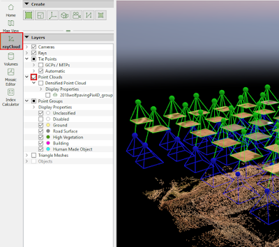
            Once the data is done processing, click on RayCloud in the sidebar and check the Point Clouds (see figure 2). *Note that Pix4D may give an error warning however, acknowledge it by clicking OK and allow it to process this step.
Figure 2: Activating Point Clouds in Pix4D

Step 2:
            Once complete, uncheck Cameras and Tie Points as shown in figure 3 to be able to view the point cloud better.
Figure 10: Locating the Hillshade Tool

Step 3:
            Move the map over to the area of interest by clicking and dragging it and/or zooming using the scroll wheel on the mouse as necessary to get it into frame. In our case, the area of interest, shown in figure 4, was several stockpiles located in the north corner of the point cloud.
Figure 4: Stockpile Location

            Once there, inspect the area by holding down the scroll wheel to orbit the area to get a good understanding of what will be analyzed using volumetric analysis.

Step 4:
            To calculate the volume of a specific area of interest, click on Volumes in the sidebar and click on the New Volume tool  then click around the perimeter of the area of interest making sure to error wide of the edge so that the measurement tool can gain an accurate base measurement to work with and accurately determine the volume above that base plane. *Note: When clicking, use the scroll wheel to orbit around the area of interest to help determine what should be included in it.

            Once the area of interest is enclosed, right click to close the polygon then click the Compute button as shown in figure 5.
Figure 5: Computing the Volume of the Area of Interest

            After Pix4D calculates the volume, the values should be displayed where the Compute button was located.

          *Note: One can rename the area of interest by clicking on ‘Volume 1’ and typing the desired name.

Step 5:
            Once the volume is computed, one may copy the information displayed to a clipboard and paste it where desired, by clicking on the icon highlighted below in figure 6.
Figure 6: Copying to Clipboard

How to Perform Volumetric Analysis Using ArcMap:

Step 1:
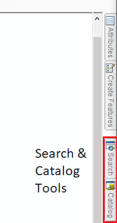
            Open ArcMap and click on the Catalog tab on the right sidebar as shown in figure 7 then click on the folder connection icon .
Figure 7: Search and Catalog Tools Located in Right Sidebar

Step 2:

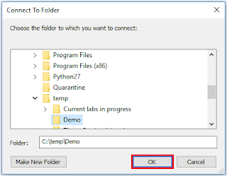
            Connect to the folder where the data from the project will be stored and click OK (see figure 8).
Figure 8:Establishing a Folder Connection

Step 3:
            The next step in the process is to create a geodatabase for the project. A geodatabase is a smart folder containing all of the linked geographic information, attributes, tables, raster datasets and, feature classes created while working on a project. Geodatabases have a special information model to allow them to relate these various pieces of information together so they may be effectively used in the ESRI ArcGIS software.

            In order to create a geodatabase, click on the Catalog tab on the right sidebar of the screen, right click on the folder created in step 2, click New then click File Geodatabase. Figure 9 is an image that shows how to create a geodatabase.
Figure 9: Creating a Geodatabase

Step 4:
            Click the Add Data icon  located in the first row of icons at the top of the screen and add the DSM on which one wishes to perform Volumetric Analysis.

Step 5:
            The next step in the process is to perform a hillshade operation to allow the user to more easily see changes in topography of the DSM.
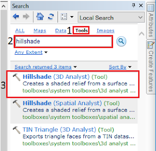
To perform a hillshade operation,  click on the Search tab on the right sidebar as shown in figure 7. Next, click on Tools, type “hillshade” into the search bar and, select the first tool in the list. Figure 10 shows how to locate the correct hillshade tool.
Figure 10: Locating the Hillshade Tool

            Once selected, a window labeled “hillshade” should appear. Within this window, in the Input raster box, select the down arrow and select the DSM. Next, click on the file icon next to the Output Raster box, double click on Folder Connections, find the folder where the geodatabase is located, click on it to highlight it, add a name that is less than 13 characters long at the bottom and click Save. Figure 11 shows the steps listed above in order from 1 to 5 and where to save the Output Raster hillshade once it is generated.
Figure 11: Output Raster Location

            Now that the input and output rasters have been taken care of, click OK at the bottom of the hillshade window to begin the processing.

Step 6:
            Once complete, create a Feature Class by opening Catalog tab, right clicking on the geodatabase created in step 3, clicking on new and, clicking Feature Class. A Feature class is similar to a shapefile in that they both contain features and attribute data; however, a feature class allows the user to do more advanced operations than a shapefile would allow. See figure 12 below to see a visual representation on how to locate the Feature Class.
Figure 12: How to Add a Feature Class

            Once Feature Class is clicked, a window should appear labeled New Feature Class. Name the feature class and click Next at the bottom of the window.

            On the next page, click on the down arrow next to the globe icon  then click Import. A new window should appear labeled Browse for Datasets or Coordinate Systems. This window, as the name suggests, sets the coordinate system for the Feature Class to match those of the DSM. In order to do this, use the ‘Look in’ dropdown to locate the appropriate DSM and click Add as shown in figure 13.
Figure 13: Setting Data Coordinate System

            Once added, click next at the bottom of the New Feature Class window three times until the following window appears (see figure 14).
Figure 14: Adding Attribute Fields

            The above window is an attribute table that allows one to tie important information to the area, in this case a stockpile, so that when the data is viewed later on, the information about it will be linked and easily accessible.

            To enter attribute information to this table, click on the first available spaces below the Field Name column, then add the following attribute data: Pile_ID, Volume_m^3 and, Base_Pile_Elevation. *Note: Feel free to add more fields as necessary to help describe different attributes of the area of interest.

            Once Field Names have been added, in the Data Type column, use the drop down list to select the appropriate type of data for each of the Field Names. There are several options to choose from however for our dataset, set the Data Type as shown below in figure 15.
Figure 15: Setting the Type of Data
            Once the Data Type is set, click Finish at the bottom of the New Feature Class window.

Step 7:
            Click on the Editor Toolbar  located at the top of the screen in the first row of icons, then click the Editor dropdown as shown in figure 16 and click Start Editing.
Figure 16: Starting Editing

            Once Start Editing has been activating and the tools in the Editor Toolbar are no longer grayed out, click on the Create Features icon . when the menu appears on the right hand side of the screen, click on the feature that appears. Once selected, a Construction Tools menu should appear. Click on Polygon then click around the base of the feature, making sure to leave some room around the base so that the volumetrics tool can accurately determine the volume. When done tracing around the area, double click to create the last point and close the polygon then click Stop Editing. Figure 17 below shows the process of creating the polygon.

Figure 17: Creating a Polygon

Step 8:
            The next step in the process is to use a tool called Extract by Mask. This tool takes a base raster and uses a mask to clip out an area of interest so that analysis can be performed on just that clipped-out portion. Figure 18 from ESRI’s ArcGIS for Desktop website, shows the process of using the Extract by Mask feature to perform specific localized analysis.
Figure 18: Applying the Extract by Mask Feature

            To perform the Extract by Mask, click on the Search tab, type in “extract by mask” and select Extract by Mask (Spatial Analyst). A window should appear with the corresponding tool. In the Input Raster box, select the down arrow and select the DSM. Next, click Input Raster or feature mask data and select the polygon file created in the previous step. For the Output Raster box, double click on Folder Connections, find the folder where the geodatabase is located, click to highlight it, add a name that is less than 13 characters long at the bottom, click Save then click OK to create the extraction. Figure 19 shows the steps listed above on how to perform an Extract by Mask.
Figure 19: Performing an Extract by Mask

Step 9:
            The next step is to take the clipped extraction and use the Surface Volume (3D Analyst) to calculate the volume of the the area of interest.
            Before using this tool, one first has to know the base elevation of the area of interest. To do this, click on the information tool  and when the Identify window pops up, set the Identify From drop down to the extraction created in step 8. Next, click around the base of the area of interest and record the base values.

            Next, click on the Search tab, type in “surface volume” and select Surface Volume (3D Analyst). When the window opens, click on the down arrow and select the extraction created in step 8 for the Input Surface. Set the Output Text File, using the file icon, to the folder where the geodatabase for the project is kept and name the file. Next, set the Reference plane to ABOVE, set the Plane Height to the value gathered by the identify tool earlier and, click OK. *Note here that if one is performing the analysis with a concave surface, set the Plane Height to below so that it takes the volume below the plane rather than above. Figure 20 is an image of how to setup the Surface Volume tool.
Figure 20: Using the Surface Volume (3d Analyst) Tool
How to Correctly Compare Temporal Datasets Using ArcMap by Resampling:
            In order to perform analysis comparing a multiple datasets of a location over time, one has to resample the data so that the pixel sizes from the datasets are the same. To do this using ArcMap, first follow all the steps above relating to ArcMap up to step 9.

            Before using the Surface Volume tool, click on the Search tab and type in “resample” and click on the Resample (Data Management) tool. When the Resample window opens, use the drop down under Input Raster to select the extraction from the Extract by Mask step. For the Output Raster Dataset, use the folder icon to save it to the geodatabase. *Note: The next line, Output Cell Size can be used if one wishes to set one dataset to match another exactly. This will not be used in this case, because it is often better to sample to a standard cell size.

            Just below Output Cell Size, there are two boxes where one can set a specific cell size for each pixel. The datasets that were worked with in this assignment were set to 0.1 by 0.1 (10cm by 10cm) cell size.

            The Resampling Technique box allows the user to define which technique to use to combine cells and the correct one to use depends on the type of data being collected. For the purpose of this assignment, NEAREST was selected. *Note: If one clicks on Show Help>> at the bottom of the window, one can read about the different options and which option would be best for the data being resampled.

            At the bottom of the Resample window, click OK. Figure 21 shows the resampling window with its options as described above.
Figure 21: Resampling Window in ArcMap

            Once the resampling is complete, one can perform the surface volume analysis as specified in step 9 of the Volumetric Analysis tutorial above.


Discussion/Results:

            Using the methods shown above, two datasets were analyzed volumetrically using Pix4D and ArcMap. The two datasets used were Wolfpaving and Litchfield. The Wolfpaving dataset, of a mining operation, was used to calculate and compare the volume of three different stockpiles (Pile A, B and, C) using Pix4D versus using ArcMap. The second dataset of a Litchfield dredging operation was used to compare the volume of one pile over time.

Using Pix4D Versus ArcMap for Volumetric Analysis:
            When performing volumetrics using Pix4D on Wolfpaving, the steps to follow were very simple and once the calculations were complete, the data could be copied to a clipboard for pasting into other programs. Figure 22 below shows Piles A, B and, C in relation to each other and table 1 below that shows the results from Pix4D’s calculations on these piles.
Figure 22: Pile’s A, B, and, C Relative Size and Relative Location
Table 1: Pix4D Volumetric Results for Pile A, B and C

            Once the volumetrics for Wolfpaving were calculated using Pix4D, they again were calculated using ArcMap and the above steps. The steps when using ArcMap were much longer and more complicated than the Pix4D results and once they were calculated, they were copied to a table and a map was created. Below is table 2 and figure 23 showing the results for the volumetric calculations using ArcMap.
Table 2: ArcMap Volumetric Results for Pile A, B and C
Figure 23: ArcMap Wolfpaving Volumetric Results Map

  Comparing the results from both Pix4D and ArcMap using the tables reveals that they are very different between the programs. These differences between the two programs could due to the method of calculation, differences in selection of the perimeter (Terrain Area) around the area of interest, or other reasons.

  The Pix4D results from the Terrain Area compared to the Total Volume results seems smaller than it should be considering Terrain Area is a measure of a 2-dimensional area and the Total Volume is a measure of the 3-dimensional volume of the piles. One would expect the volume to be significantly larger than the area as shown by the ArcMap Calculations.

Using ArcMap for Temporal Volumetric Analysis:
            After comparing the difference between using ArcMap and Pix4D for volumetric analysis, ArcMap was used to compare the volume of the Litchfield stockpile over time. This type if analysis is known as temporal analysis and is important if one wishes to track the progress of mining or dredging operations over time.

            When performing temporal analysis it is important to have consistency between datasets. This can be achieved by flying with the same sensor at the same time of day, at the same altitude, etc between datasets so that as many variables other than the area of interest are minimized.

            The Litchfield stockpile, shown in the figures below, was flown on multiple occasions and the stockpiles were extracted, resampled to 10cm GSD, and surface volume analyses were performed to compare the volumes over the dates shown in the figures below. Figures 24-26 are maps of the Litchfield stockpile from July 22nd through August 30th 2017.
Figure 24: July 22nd Flight of Litchfield Stockpile Volumetric Map 
Figure 25: August 27th Flight of Litchfield Stockpile Volumetric Map

Figure 26: August 30th Flight of Litchfield Stockpile Volumetric Map
            Once volumetrics were performed on the Litchfield stockpile, a table (table 3) containing the plane height above which the surface volume was measured, the area of the pile on that plane and, the total volume of the pile on different dates was created.

Table 3: Litchfield Stockpile Volumetric Comparisons

           *Note: Looking at table 3 above, it is clear that the largest volume of material in the stockpile was around August 27th.

         
Conclusion:

            Volumetrics is a tool that many may find useful in certain applications such as mining and dredging. Using UAV systems to collect this data can be beneficial because a UAV system is able to gather higher resolution datasets with which to perform these volumetric analyses. With these systems and analysis methods it can allow companies to accurately determine quantities of material and thus they can determine overall costs and profits.

Final Note:
            When comparing between the two methods of calculating volumetrics and which should be used, I would recommend using ArcMap as Professor Hupy has used its volumetrics to calculate the volume of piles at a mining operation and the measured values compared to the calculated values were within 0.01% of each other.